NYFW Spring 2012: Pastel Colors
This past Spring and Summer, the fashion world has seen a fair amount of neon. The super brights still found their way onto the runway this season, but for a number of standout collections at New York Fashion Week Spring 2012, pastels were a refreshing palette cleanser.
Light, airy shades of yellow, green, pink, blue and orange appeared in ready-to-wear in various techniques of colorblocking and styling against prints or in monochrome manners. These Spring hues also appeared in footwear, handbags and accessories.
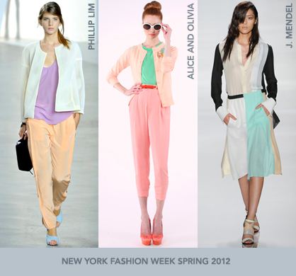
The colorblocking trend continues and was best seen this season in flirty pastels. J. Mendel’s line showcased dresses with panels of Easter green, peach and yellow, paired against black for a slight edge. Mendel’s wide-strap sandals also included the motif of colors.
LadyLUX via Style.com
Other collections expressed pastel colorblocking by pairing different combinations of blazers, tops and bottoms. Diane von Furstenberg’s line matched mint blouses and clutches with orange-tan trousers and blues contrasted with greens. Philip Lim went sherbet flavored with his looks: Light purple, peach and pink were mixed together with white touches for a lighthearted feel.
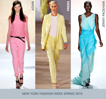
ADAM’s use of color was expressed in head-to-toe looks. Adam Lippes used pale shades of purple to create polka-dot prints on feminine dresses. In a more casual look, a bubblegum pink top with sheer sleeves was styled with pink trousers for a chic, monochrome look.
LadyLUX via Style.com
Going a different route, Alice and Olivia, Preen, and Richard Chai found inspiration in matching prints with soft tones for striking looks. Alice and Olivia’s candy-coated Spring line fused pastel yellow, green and pink. Aside from pairing with one another, the palette popped against black and white stripes.
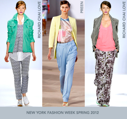
Taking the delicate colors to a more graphic level, Preen quilted an array of tones to create a checkered pattern. The design was used in ladylike blouses and streamlined dresses and worn with solid colors or lace, or contrasted against a black and white print. The collection also featured colorblocking and matching jacket and trouser ensembles.
Richard Chai’s runway show was sprinkled with oranges, sea-greens and blues for both womenswear and menswear. The unexpected color range was worn with mustard stripes, slate-gray prints, and some such combinations for some exciting eye candy.
The soft hues weren’t just for daytime, as proven by Jenny Packham. The designer created elegant, flowing chiffon gowns with an assortment of lime, tangerine, lemon and light blues. The color was enhanced with degradé effects and with appliqués of sequins in floral arrangements on Grecian-style dresses.
The fresh mix of pastels appeared just in time to give fashion a color makeover. The girly, feminine palette proved to be flirty, bold and very versatile in creating daytime or nighttime looks.
This article was contributed by Annette Tang of the VersaStyle. You can follow Annette and her fashion adventures on Twitter at @theversastyle.
Tagged in: trends, new york, new york, new york fashion week, runway, spring 2012, color, diane von furstenberg, preen, adam, richard chai, pastel colors, j. mendel, jenny packham, alice and olivia,
LadyLUX via Style.com