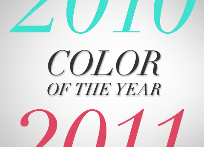
Out with turquoise, in with honeysuckle: New ‘Color of the Year’ declared
As 2011 gears up for a new year a fashion, it’s nice to reflect on what made 2010 a colorful year. Pantone, the company that sets the standards for color, annually releases a Color of the Year. This year, 2010, was dedicated to PANTONE® 15-5519 Turquoise. Although fashion designers seem to create a trend effortlessly, coincidently creating a fashion craze that will define their line—sometimes (consciously or not) they share ideas.
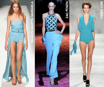
The Spring RTW 2010 runways were no exception. Turquoise—the color of the ocean and the gemstone—spiced up vibrant collections by Maison Martin Margiela, Zac Posen and Derek Lam, transporting viewers to a tropical island.
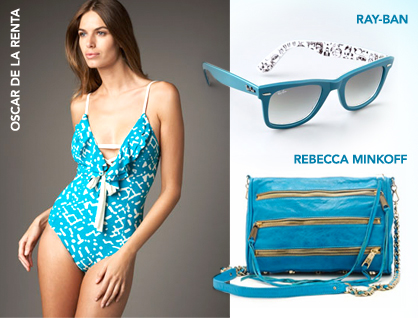
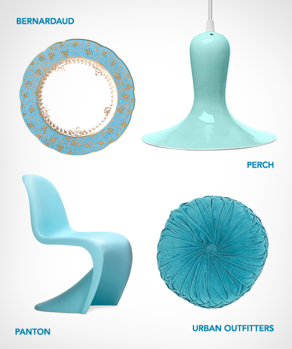
When the shows ended last year, the department stores quickly got their hands on the color in every product imaginable—from gowns and swimwear to accessories and home goods. Due to its summery disposition, turquoise was an easy choice for resort wear, such as Oscar de la Renta’s swimsuit (pictured below) or Mara Hoffman’s modal beach cover-up. It also made its way into accessories, such as watches, jewelry (of course) and handbags, such as the Rebecca Minkoff bag in the image below.
This year, say adios to turquoise: The color has been supplanted by honeysuckle pink. Those experts at Pantone have said this pink shade is “a brave new color, for a brave new world.” This hot hue is intended to knock your socks off and provide a boost in uncertain times.
“In times of stress, we need something to lift our spirits. Honeysuckle is a captivating, stimulating color that gets the adrenaline going – perfect to ward off the blues,” Leatrice Eiseman, executive director of the Pantone Color Institute for 25 years, declared to NY Daily News.
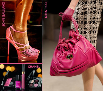
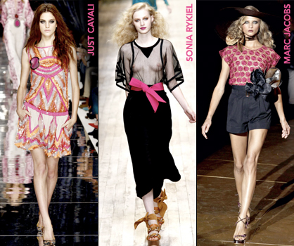
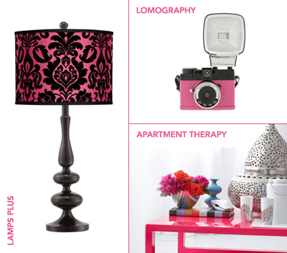
This means that pink will now be the color to watch. Expect to see it cropping up on everything from microwaves and candlesticks to purses and evening gowns.The Pantone color authorities arrive at their choice each year by polling graphic, industrial, fashion and other designers across the globe. This orangey-pink tone, officially named Pantone 18-2120 TCX, emerged repeatedly. Why?
“There’s an innate optimism to pink,” Jonathan Adler, an interior designer who often displayed bright shades of pink in his 2011 collections, told The Wall Street Journal. “As we speak, I’m wearing a hot pink shirt.”
The color is supposed to make products of all types fly off the shelves. “We also want [people] to stop and say, ‘Oh, neat color. Maybe I need to buy those plates,’” Eiseman told WSJ.
Vivid hues are no stranger to being selected. Red tones, claimed Eiseman, are a marketer’s delight, with pink shades in particular being attractive, creating a desire to “to pick it and chew it.”
Eiseman predicts honeysuckle will evoke different meanings, maybe bringing to mind happy childhood memories, an image of hummingbirds or a sugary taste.
So this year, pinks will not be limited to spring or summer. The color is expected to trickle down quickly from the international fashion runways.
Both Joanna Clay and Katherine Sweet contributed to this article.
Tagged in: pantone, pink, turquoise, color of the year, honeysuckle,
Purple Neon/ LadyLUX